Banner advertising in online marketing.
Banner advertising is and remains a popular channel in online marketing. However, in times of ad blockers and banner blindness, the acceptance and reaction of users is strongly dependent on the design of the banner ads. In this blog article, we'll show you what to look out for when designing your banner to successfully market your business through display and social ads.ds zu vermarkten.
- Note standard sizes and specifications
- Design and service promise
- Choose the right visuals for the target group
- Insert Call to Action
- Create an appropriate landing page
Convert with these banners
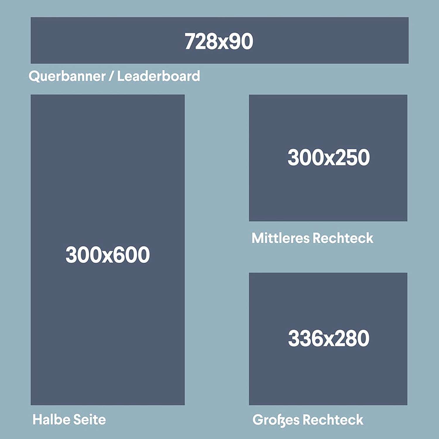
01 Banner sizes
When designing your banners, make sure you stick to the most effective standard sizes. In addition, you should review the specifications of each network and platform that you want to promote.
- 728×90px — Cross banner / Leaderboard
- 300×600px — Half page
- 300×250px — Middle rectangle
- 336×280px — Large rectangle
02 Design and service promise
The banner ads should be shown as close as possible to the main content of the page. The company logo must be clearly visible, it should finally remain in the mind of the users.
The product or service promise must be attentive. It should take the most part and should be the first thing the viewer sees. The content must therefore be able to be detected quickly and arouse desire for more. This can be achieved by using graphic effects, good text, keywords or a good slogan.
Create a sense of urgency by using high-contrast, rich colors. Banner ads do not always have to be subtle. Choose the right color. Since each color has its own association and influence, choose the colors you use wisely. Because that's the first thing a user perceives in a banner ad.
There are two options when choosing the background for the banner:
- A solid color
- A background image
Solid color
A monochrome background reinforces the statement, forms a natural contrast to the CTA and it does not detract from the statement. A plain background is a good idea if your advertised product itself has a lot of elements. So it's good to not distract the reader from them. If people or slogans are displayed on your banner, solid backgrounds are also better. You should choose a background that either matches your company's CI or that makes your logo stand out.


Background Image
If you do not present a physical product in your banner, it's a good idea to use a photo as a background. Just make sure that the background is in contrast with the statement, so it is easy to read.
To create a successful web banner it is important to use easy-to-read text. Since the viewer sees the message only briefly, the text must be clearly readable and understandable. Avoid extremely thin or italic fonts.
Headline
The goal should be to make a targeted and appealing statement with as few words as possible. Too much information in a banner quickly makes it become disorganized and messy.
Keep it short and sweet. Be aware of what you want to communicate. You can be funny or share your information clearly. Use clever slogans or just specify what you sell. Most banners contain physical verbs like:
- See
- Come
- Celebrate
Ask your readers to do something - such as visit the site, subscribe to a newsletter, or accept an offer.
Subheadlines
In your banner you should not use more than 2 sub-headings, so as not to make the statement too long. With these subheadings, you can affirm, explain, and add additional information to your message. They should be placed well visible in the banner, but should not affect the CTA. However, it is by no means absolutely necessary to include subheadings in your banner if the headline is already meaningful enough.
03 Visuals
Pictures sell well and often say more than a thousand words. Appealing and emotional images arouse interest, appeal to your target audience and encourage them to click on the banner. Animated banners are usually better than static, but the animations should not distract from the content of the ad.
However, images should be used wisely and only when needed. It is important to use relevant images or graphics related to the product. It is not always necessary to include pictures in your banner. A good text and a nice typography can be just as effective.
Avoid using popular stock images as they may have been used by the competition.
TIP: Ask yourself if you would click on your banner, if it appeals to you and if you want to know more about the product or services.
04 Call to Action
The CTA or "Call to Action" tells you what to do next. Attention should be paid to the text and the color.
When choosing the text, ask yourself the question: what do you want the readers to do?
Do you want to sell a product?
Buy now
Should the visitors inform theirselves?
Inform now
You want people to act with your banner right away, then you should communicate that with words like now or immediately.
05 Landing Page
The basic goal of a landing page is to satisfy the needs of your client, to create or reinforce a suitable impulse of action and, at best, to induce an interaction. With your advertising banner and a matching landing page, you can specifically promote your product and generate traffic.
The following goals of your landing page can be:
- Provide information
- Sell products
- Register for a community, service, etc.
- Represent offers for products or services
Be sure if you ask your readers to look at your landing page, to get them on the right landing page. Especially when products or services are advertised, you should immediately come to the advertised product or service. If you only get to the main page, it could happen that the user does not know what he should do there or has to search for the offered product and leaves the page again.
Conclusion
These are the most important tips for creating successful converting banners that appeal to your audience and encourage them to do something you want. If you follow these design rules, nothing can go wrong. If you are not sure what your target audience finds visually appealing, then try multiple designs with different slogans and call to actions.
In summary, these facts are to be considered in the banner design:
- No content overloading
- Use unique images
- Choose meaningful words
- Customized design according to the target group