UX - Walk between design and conversion
When talking about UX (User Experience) in the context of marketing, it is abstracted about the experience or the evaluation of an interaction, between customer and product - regardless of whether online or offline. The emotions that we feel every moment when we as a consumer lead to mind a product (or even a website), determine the respective subsequent manner of action. Whether that ends in a conversion, we would like to know in advance - because we have a goal in mind, which must be achieved. The way there is determined by design and communication, which can influence the conversion in different ways.
"Positive user experience leads to joy and acceptance, negative UX causes problems. Design has a big impact on people's behavior."
German UPA e.V. (2018): https://germanupa.de/events/world-usability-day, [09.12.2018].
Conversion and needs
The thing is ..... in fact we can not predict if someone will buy a product or not - unless there are already empirical values. Even then it is not guaranteed that the same product will produce the same value among other providers. As an online marketer, however, one can orient oneself to benchmarks primarily in the initial consultation before a campaign.
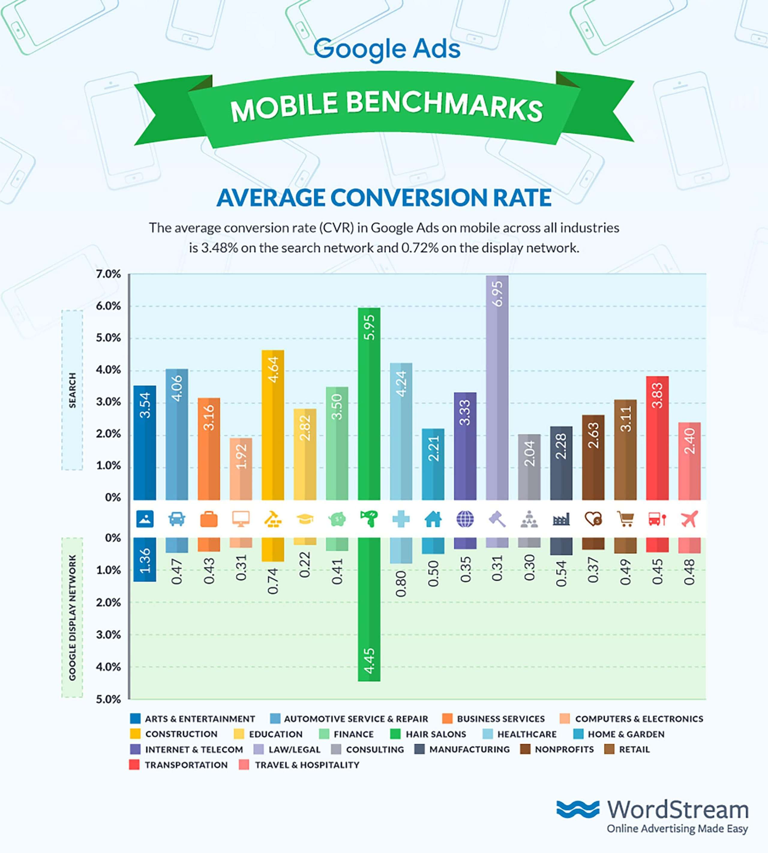
"Not all visitors of a website have the potential to convert. Often they pursue a different goal than to make a purchase or sign up for a newsletter."
Vgl.: Dan Barker (2013): Why Conversion Rate is a Horrible Metric to Focus On, https://www.smartinsights.com/goal-setting-evaluation/goals-kpis/why-conversion-rate-is-a-horrible-metric-to-focus-on/, [09.12.2018].
It is easy to see that these are generalized values that can vary greatly depending on the region. The example in Figure 1 is only intended to illustrate how broad such an evaluation can be in advance. Real knowledge, we can, however, only get after the first test.
Why not let it be now? Well, in times in which the customers of tomorrow with each generation spend more time in online channels, it would probably be negligent as entrepreneurs not to advertise where there are potential customers. Besides, there are certain principles to follow - but more on that later. Before that, I would like to start quite differently approaching this theme context design conversion related to UX.
Satisfaction thought differently
At this point I would like to put a thesis in the room, which I want to look at with you apart from the subject of online marketing:
Every one of us goes through conversions every day, the initiation of which, from a process-critical point of view, always comes from an external source.
Far-fetched or too abstract? I try to explain it in other words. If one considers the topic around conversions human, then it is probably always about the fulfillment of "needs" and their "satisfaction". It could also be thought of as a kind of internal conversion that subconsciously drives us to change an unfinished / unsatisfactory state - except that we do not yet know the state, which is why the associated need often arises spontaneously. Paradox .... or not?
Abstract: I bring an individual from state A to state B.
Now, one might ask oneself further questions, such as: Do we, as persons, consistently follow an inner need for satisfaction without even knowing how to attain this state? Is this a linear movement in our actions or are we spinning in circles? Is it always about solving problems? Is it in our nature to meet new needs every day? Are we actively looking for new "possible" needs that we do not yet know from a luxury idea? Where do we differentiate between optional needs, will and impulses - and, most importantly, how are we influenced in what way we bring about satisfaction? Phew..

Simplified consideration: It is quite clear - if we assume a concrete action (such as a product that is bought online), that is probably a clear process, as Figure 2 shows. However, the need is often only awakened (window shopping). The distinction lies among other things in the consideration of the status of a condition, above all with regard to the consciousness of the individual.
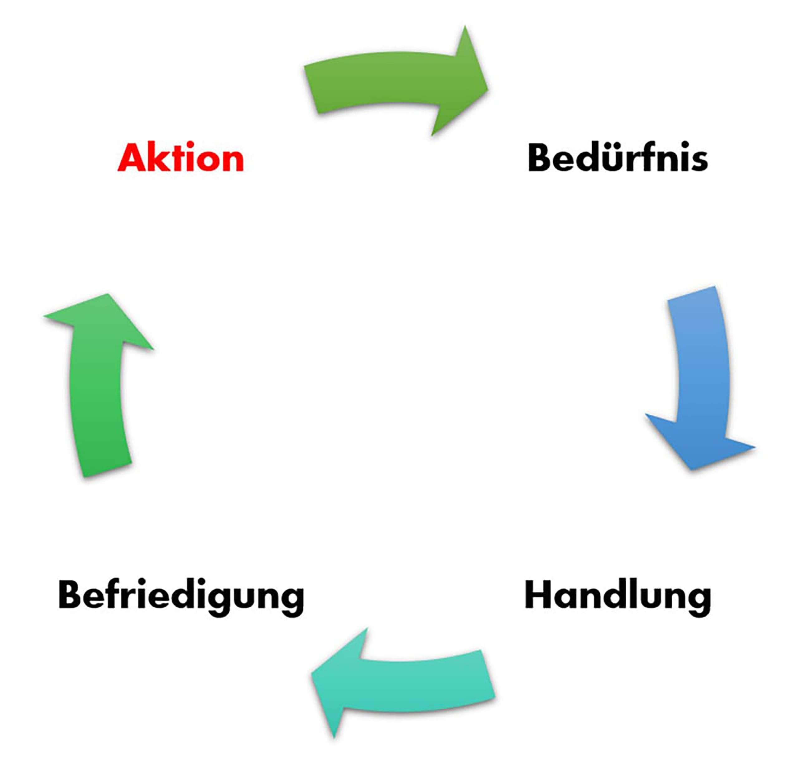
Therefore, one of the above-mentioned thesis, subordinate cycle always needs a concrete action, in order to create a need in the first place. The nature and our decision then to satisfy this need then sets the course for our desired action. In short: An online ad shows a product of an online shop (action). The web user decides to purchase such a product (need). In our shop he receives exactly the product and buys (action). Once the product has arrived at him / her, he is satisfied (satisfaction). Sounds easy or? Unfortunately, we are certainly not the only provider (that would be nice), which is why we have to include other aspects.
Why it does not work without UX
As just stated, it could be so easy. The fact is that the customer not only looks at our site, but also compares several other providers with us. Smart readers now correctly suspect that we are increasingly in the subjective area and we have to ask ourselves other questions.
From the thoughts of a website visitor (in part):
Can I trust the site provider at all?
Is the meaning of what is shown to me obvious or does it seem confusing to me?
Where should I actually do what on the site?
Why should I do this right here and now and not later elsewhere?
How much effort does it take to choose the offer?
Does it make a nice impression?
Does my gut feeling say yes?
We note - these questions are characterized by strong subjectivity and opinions can not be answered wrong in principle in their statement. So if we consider n-permutations as a web page can be in appearance and build up, then we will absolutely always find someone who feels addressed.
Right - we can not build an infinite number of websites!
That's why we focus on those who are testing broadly which things work best and then trying to figure out how that fits our target audience. Thankfully, it has been shown that in many ways there is a Gaussian distribution - now we just have to find the middle range.
Conversion through design
"[...]go beyond headline conversion rates to segment conversion by different types of visitor."
Vgl.: Dan Barker (2013): Why Conversion Rate is a Horrible Metric to Focus On, https://www.smartinsights.com/goal-setting-evaluation/goals-kpis/why-conversion-rate-is-a-horrible-metric-to-focus-on/, [09.12.2018].
This quotation from Dan Barker tells us very well, which is briefly described above. We can not "satisfy" all customer groups with a concrete page/design - we are all a bit different. But to be as efficient as possible and to use our resources well, we should address those target groups through our design and the purpose of UX, which is also the best to convert. How do we achieve this?
Content: Communication, Identification & Emotion
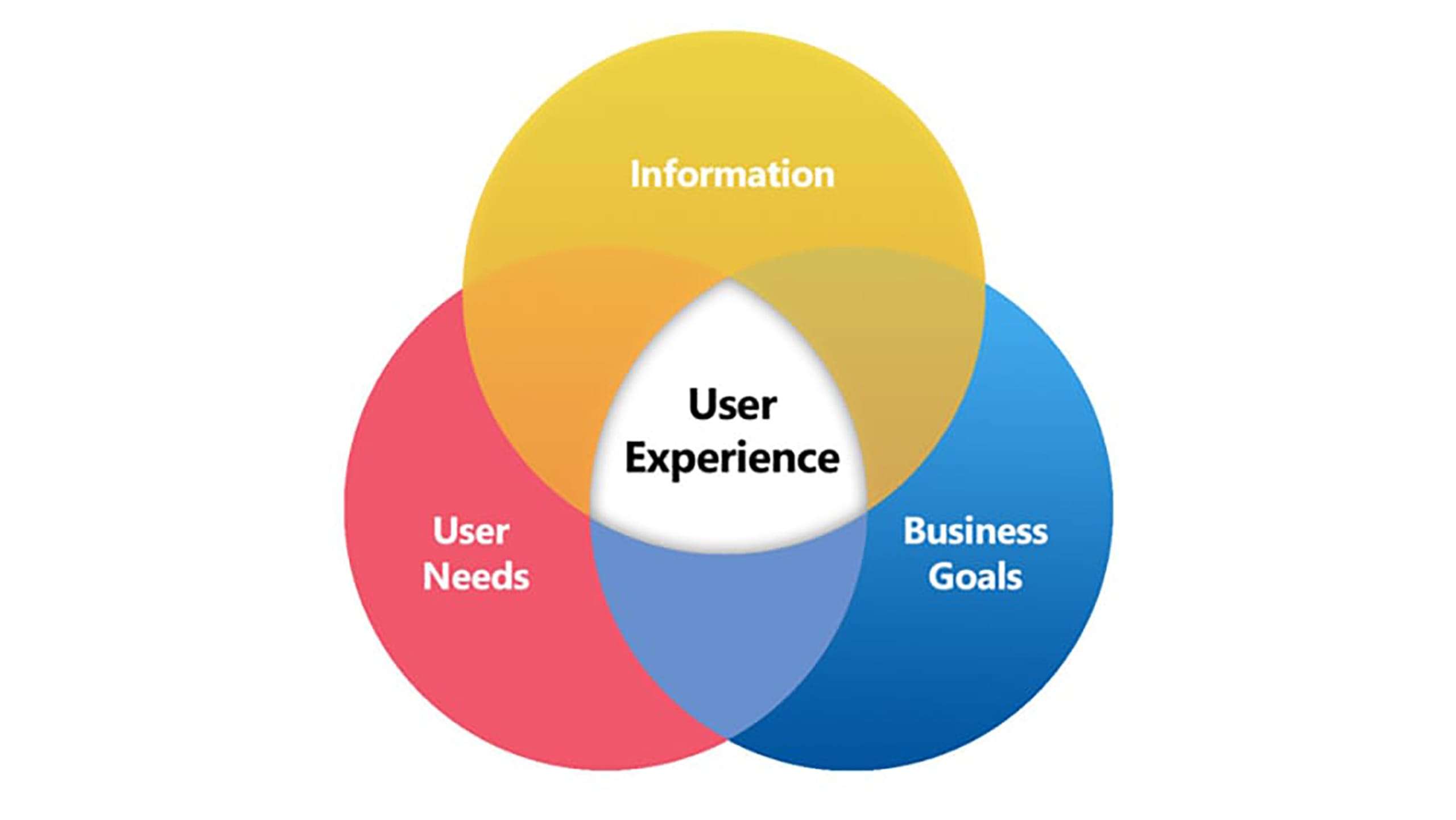
If we leave the business goals aside - and YES, you can divide all three areas even more diverse - then there is good UX to 2/3 of a combination of providing information and covering the objective needs. Of course, everything has to work together in a balanced way.
On our journey to conversion we are therefore in the worst case only in the status that the user got information on the website to get to know if he even feels a need for the offer or not. Since we are not at his location, we do not have many opportunities to convince the visitor - the website has to do it for us. How? Through effective design (structure, colors, effects, etc.), correct communication, apparent benefits and appropriate price.
In this phase, we try to use as much of the chance as possible that the visitor will use the valuable action that we wish so much, through proven methods that are adapted to the nature of the expected webpage visitor (age, preferences, interests, etc.), on the visible side of the page. This is exactly the first time that a stark contrast emerges, because as a provider we want fast conversion and a high rate - the visitor, however, wants enough information and "enough" is very subjective. A good example of different communication and information are the following videos:
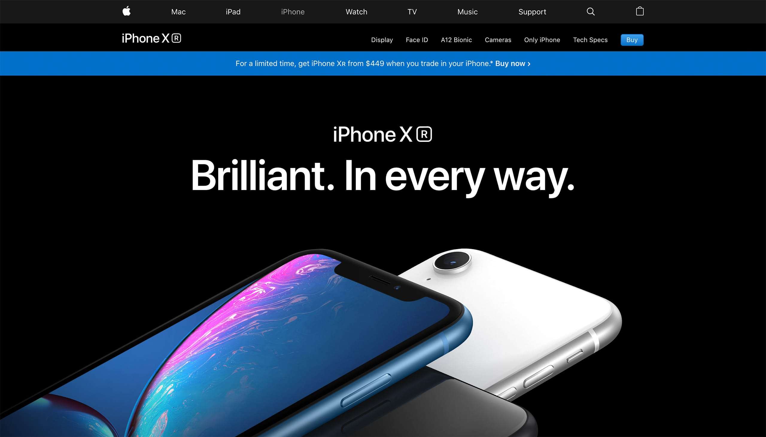
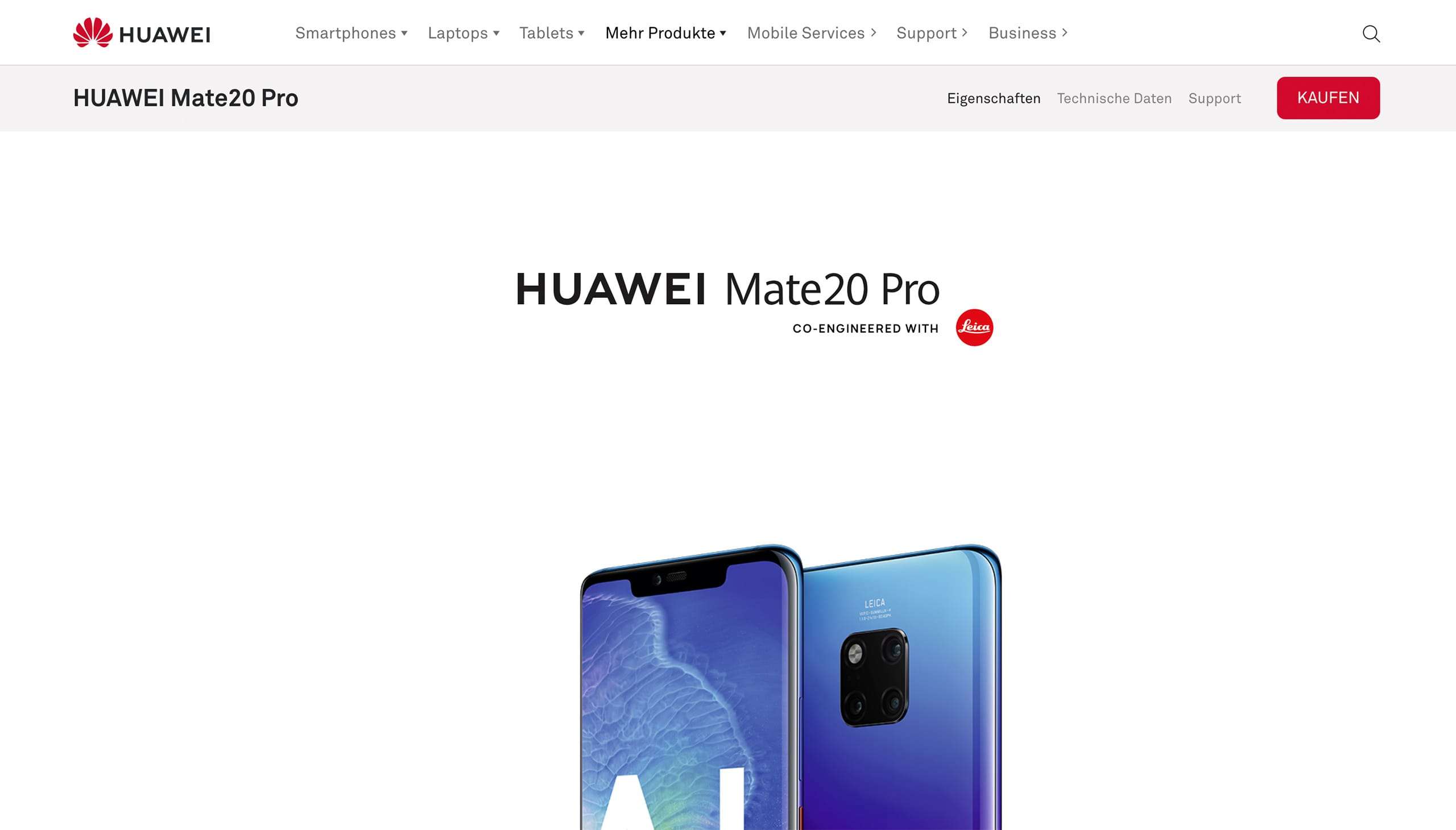
In short: unlike Apple, HUAWEI is much more present in generating trust in the product. The design quickly shows a representation of seals of approval, as well as a greater focus on technical parameters, whereas on the iPhone the focus is more set on playful effects and less on confidence and technology. Color choice and contrast is just as different.
A/B or maybe C?
An interesting food for thought is also the following quote on the context conversion and content. The connection is comprehensible, whereby it is above all a matter of providing a website with an additional offer. A good example is planning or calculation programs that provide added value but may distract attention from the actual purpose, such as an appointment request.
"Making Your Site More Engaging May Reduce Your Conversion Rate"
Dan Barker (2013):
Why Conversion Rate is a Horrible Metric to Focus On, https://www.smartinsights.com/goal-setting-evaluation/goals-kpis/why-conversion-rate-is-a-horrible-metric-to-focus-on/, [09.12.2018].
The statement "the more gimmicks, animations and subtleties - the better" is the website, therefore, only partially is true, because they may lead to long loading times, display errors in outdated browsers or other anomalies, to which we, at the time the visitor is on the website, unfortunately have no influence.
At the end of the journey, one question remains - How do you build an ideal balance that results in the highest possible quality of UX between design and conversion?
The answer hides between the lines already in the small title and rhymes:
It is best to test.
I hope no one has just thought that I just leave it that way. The following checklist should help you get started.
9 points checklist - approach
The following points serve as an approximation to the successful determination of the contents of the website.
- Define problems or needs that your product will solve.
- Identify decision features why your product should be purchased.
- Assign decision characteristics to problems and form categories.
- Formulate which type of human is most likely to be found in each category. (1: n)
- If multiple types apply to one category, then you have defined too many types.
- Choose the group that is most likely to be reached through your channels. (Facebook, Google, posters, offline, online, etc.)
- How does your group want to be talked to? (formal, easygoing, casual, dialect, etc.)
- Is your group aware of the problem or not?
- Ask so many people in your group (strangers) if you are trustworthy as a provider or not.
If these points are answered, it should be possible to determine the content of a page, or to have learned what content is still missing and how the offer must be communicated. Spoil alert: Answering these questions will raise follow up questions - but you should be able to answer them with a little thought.
Endnote: The limits of optimization
Finally, it should be said that the journey is not over with a unique design. Especially online, where companies have limited opportunities to individually address their potential customers, success is tied to the highest possible rate of iteration. The direct customer contact allows us (especially the good sellers among you) to directly influence the course of a conversation and to pay attention to subtleties in facial expressions and gestures that are denied us through the Internet. What stays with us is data, and at best a lot of it - especially when they categorize and differentiate in certain aspects. Finding out which content is relevant and necessary to satisfy the needs and transform them into satisfaction (conversion) can be an exciting but also a troublesome task - especially if there is a high number of permutations of elements according to which a user experience is composed of. Even a simple landing page can become a resource trap.
A solid conception can be the direction for such a problem. Think about which customers are most likely to be addressed and identify with just that segment. The more accurate and sharper you can focus on it, the better the elements and the arrangement can be displayed on a digital experience. Whether or not it actually comes to the much-anticipated conversion is not wholly in our hands - but we have plenty of opportunities to pave the way there as we see fit for our travelers.